> ## Documentation Index
> Fetch the complete documentation index at: https://docs.architect.new/llms.txt
> Use this file to discover all available pages before exploring further.
# Bring Your Own Design System
> Turn your own design guidelines into a reusable theme — import them from Figma, a PDF, a GitHub repo, or a zip, add design instructions and brand assets, and Architect applies that look to every app you build.
Architect ships with 45+ ready-made themes, but you don't have to settle for a preset. With **custom themes** you can bring your own design system — import your brand's guidelines, layer on your own instructions and assets (like your company logo), and Architect will apply that exact look and feel consistently to every app you build with it.
You can import your design guidelines in whatever form you already have them: a Figma file, a design-guidelines PDF, a GitHub repo, a zip of your codebase, or raw CSS.
## Set Up Your Theme
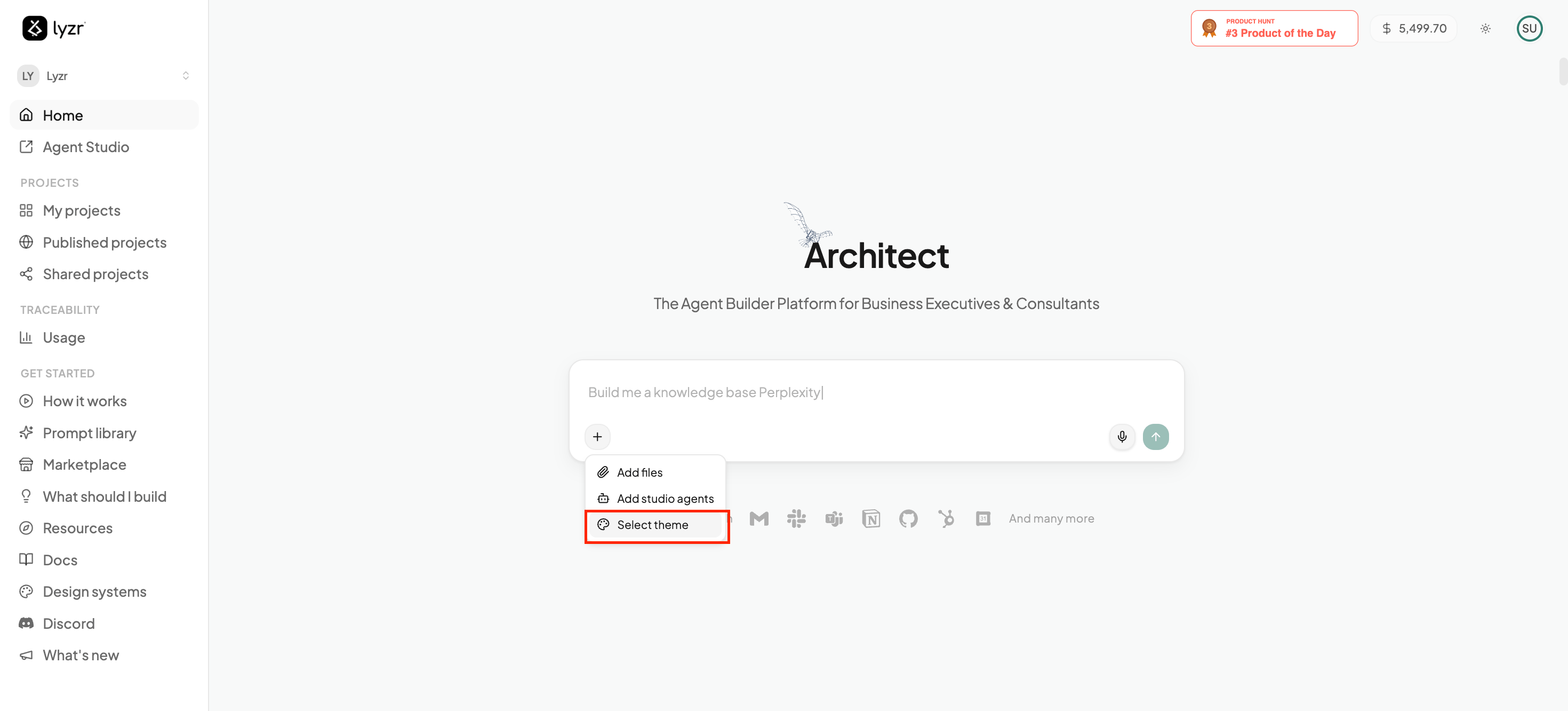
From the homepage prompt box, click the **+** menu and choose **Select theme**.
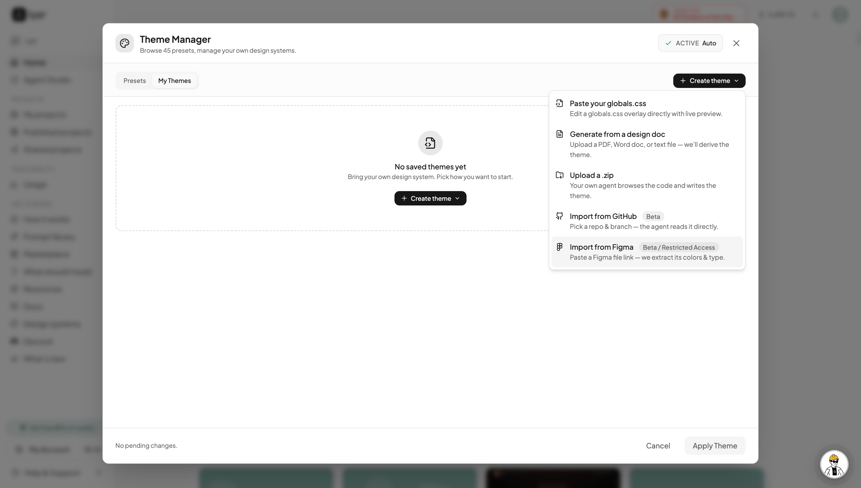
 This opens the **Theme Manager**, where you can browse the built-in presets or click **Create theme** to build your own. Choosing **Create theme** gives you several ways to import your design guidelines (see [Ways to Import](#ways-to-import) below) — pick whichever matches what you already have.
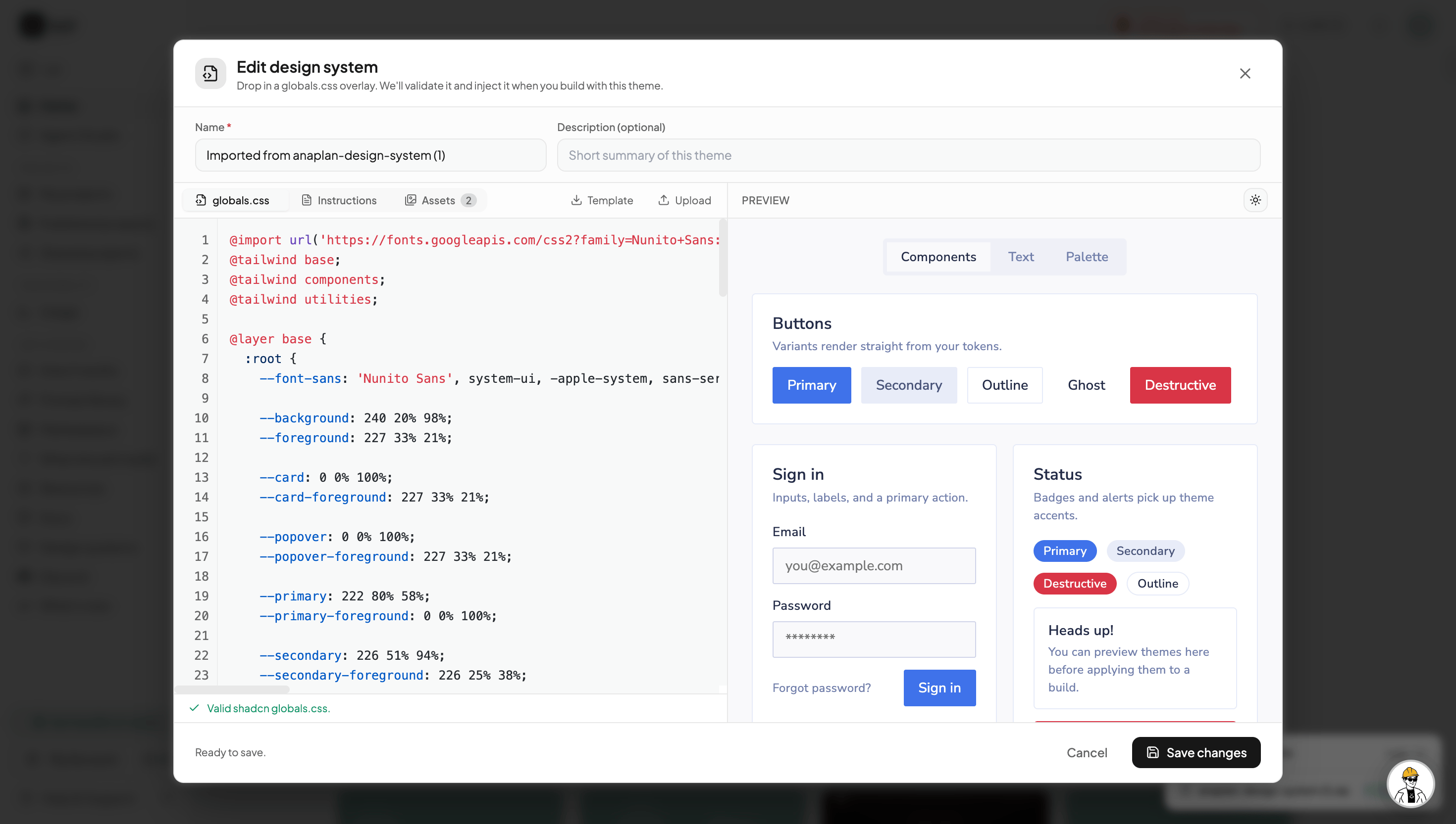
 Architect turns your import into a theme and opens the **design system editor**. Here you can give it a **name** and description, fine-tune the generated **globals.css**, add **instructions** for how the design system should be used, and attach **assets** such as your company logo. A **live preview** (Components, Text, Palette) shows exactly how the theme will look before you apply it. When it's valid, click **Save changes**.
 ## Ways to Import
Pick the source that matches what you already have — Architect handles the rest.
Paste a Figma file link and Architect extracts its colors and typography into a theme. *(Beta — restricted access.)*
Upload a PDF, Word doc, or text file of your brand or design guidelines, and Architect derives the theme from it.
Connect a repository and pick a branch — Architect reads the code directly and builds a matching theme.
Drop in a zip of your codebase and Architect browses the code to write a theme that matches it.
Already have a Tailwind / shadcn `globals.css`? Paste it in and edit it directly, with a live preview as you go.
## Fine-Tune Your Theme
Once imported, the design system editor lets you shape every part of the theme:
Edit the underlying CSS variables — colors, fonts, radii, and more. Architect validates it as a proper shadcn `globals.css`.
Add notes and rules about how your design system should be applied, so Architect honors your conventions while building.
Upload brand assets — like your company logo — for Architect to use across the apps it generates.
Preview the theme on real components, text, and the full color palette before applying it to any build.
Once saved, your custom theme lives in the **Theme Manager** alongside the presets. Select it before you build (the same **+ → Select theme** menu) and Architect applies it to the generated app — giving every project you build a consistent, on-brand design.
## Ways to Import
Pick the source that matches what you already have — Architect handles the rest.
Paste a Figma file link and Architect extracts its colors and typography into a theme. *(Beta — restricted access.)*
Upload a PDF, Word doc, or text file of your brand or design guidelines, and Architect derives the theme from it.
Connect a repository and pick a branch — Architect reads the code directly and builds a matching theme.
Drop in a zip of your codebase and Architect browses the code to write a theme that matches it.
Already have a Tailwind / shadcn `globals.css`? Paste it in and edit it directly, with a live preview as you go.
## Fine-Tune Your Theme
Once imported, the design system editor lets you shape every part of the theme:
Edit the underlying CSS variables — colors, fonts, radii, and more. Architect validates it as a proper shadcn `globals.css`.
Add notes and rules about how your design system should be applied, so Architect honors your conventions while building.
Upload brand assets — like your company logo — for Architect to use across the apps it generates.
Preview the theme on real components, text, and the full color palette before applying it to any build.
Once saved, your custom theme lives in the **Theme Manager** alongside the presets. Select it before you build (the same **+ → Select theme** menu) and Architect applies it to the generated app — giving every project you build a consistent, on-brand design.